
Naskh vs Kufi: What Is the Difference?
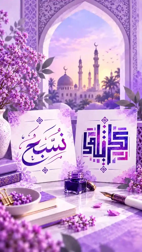
If you have spent any time scrolling through Arabic fonts, you have probably noticed that some look soft and flowing while others look like they were built from straight lines and sharp corners. Those two looks usually come from Naskh and Kufi, two of the most recognized styles in Arabic writing.
They share the same alphabet but almost nothing else in terms of personality. Naskh is the script most people read every day. Books, newspapers, websites, and most printed Qurans use it because the letters are clear, balanced, and easy on the eyes.
The name Naskh comes from the Arabic word for copying, and it fits. The script developed around the tenth century, when scribes wanted something quick to write and simple to read. Calligraphers like Ibn Muqla set down the rules for its proportions, and the result was a rounded, evenly spaced script that still looks familiar today.
Kufi is much older and much bolder. Its geometric shapes show up on coins, mosque walls, and early manuscripts, and today it is a favorite for logos and posters. Knowing which one fits your project saves a lot of trial and error.
Whether you are working on a wedding invitation, a brand name, or you are just curious about what you see on screen, a good Arabic font generator lets you type one word and compare both styles in seconds. Below, we break down what makes each script unique and how to pick between them.
Understanding the Two Scripts
What Is Naskh?
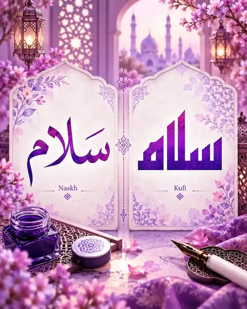
The name Naskh comes from the Arabic word for copying, and it fits. The script developed around the tenth century, when scribes wanted something quick to write and simple to read. Calligraphers like Ibn Muqla set down the rules for its proportions, and the result was a rounded, evenly spaced script that still looks familiar today. The strokes are curved, the dots and vowel marks sit comfortably around the letters, and long passages stay readable.
What Is Kufi?
Kufi takes its name from the city of Kufa in Iraq, and it is one of the earliest scripts used to write the Quran. The letters are upright and angular, built from straight strokes and wide horizontal lines that give them a strong architectural feel. Early versions had very few dots or marks, which made them harder to read but perfect for decoration. Type the same name into a calligraphy generator using both scripts and the contrast is obvious right away.
The Arabic font generator lets you
The Arabic font generator lets you type or paste Arabic text and preview it instantly across a range of Arabic font styles — modern, traditional Naskh, Kufi-inspired, handwriting and decorative. Adjust the color, background, size and alignment, then download your design as a high-quality PNG or JPG image.
This tool created-paste text tool instead.
When to Use Each Style
- Choose Naskh for long paragraphs, articles, and any text people need to read comfortably
- Use Naskh when clarity matters more than decoration, like menus, captions, and forms
- Pick Naskh for Quran verses, duas, and learning materials made for students
- Go with Kufi for logos, headlines, and brand names that need a strong identity
- Kufi works beautifully on posters, banners, wall art, and large format prints
- Kufi suits modern, minimal designs that still want a touch of heritage
- Match the mood to the style, soft and flowing for Naskh, bold and structured for Kufi
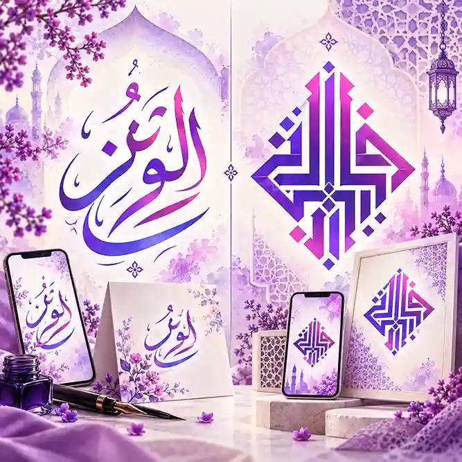
Choosing Between Naskh and Kufi
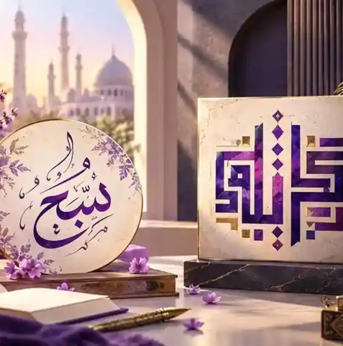
Naskh vs Kufi
The easiest way to decide is to ask who will be reading your design and how quickly they need to understand it. If the text has to be read at a glance or in large amounts, Naskh is the safer choice. If the text is short and the goal is to make an impression, Kufi gives you more character and a stronger visual presence.
If you are still unsure, test both. Put your own words into an Arabic calligraphy tool, switch between the styles, and see which one matches the feeling you want. A style that looks great on a poster might feel heavy on an invitation, and you will only know by seeing it with your own text.
Frequently Asked Questions
Is Kufi older than Naskh?
Yes. Kufi is one of the earliest Arabic scripts, while Naskh became widely used later, around the tenth century.
Which script is easier to read?
Naskh. Its rounded letters and clear spacing make it the better option for long text and everyday reading.
Can Kufi be used for Quran text?
Early Quran manuscripts were written in Kufi, but modern printed copies mostly use Naskh. Today Kufi is more common for decorative purposes.
Which style works better for logos?
Kufi is a popular pick because its clean geometric shapes look sharp at any size. Naskh can work too if you want a softer, more traditional feel.
Do Naskh and Kufi use the same letters?
Yes, both use the same Arabic alphabet. The difference is in how the letters are shaped, spaced, and connected.
Can I preview both styles without design experience?
Absolutely. With a free Arabic font generator, you can type your text, switch styles, and compare the results without any design skills.