What Is Naskh Calligraphy? Why It's One of the Most Readable Arabic Scripts
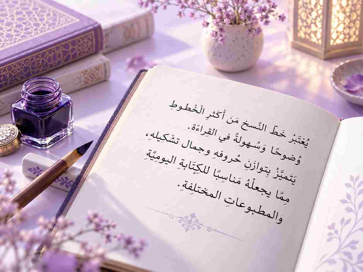
Naskh calligraphy is probably the Arabic script you’ve encountered most often, even if you never learned its name. If you’ve ever picked up a printed Qur’an, opened an Arabic novel, or scrolled through an Arabic news site, there’s a good chance the words in front of you were set in Naskh. It’s the script most people picture when they think of “normal” Arabic writing, and that’s not an accident.
What Naskh Actually Looks Like
The Shape of the Letters
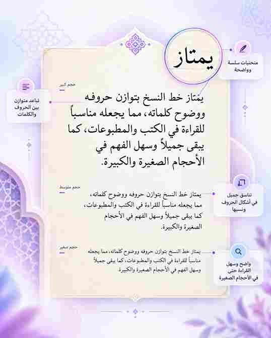
Naskh has a fairly compact, rounded look, and the letters sit closely together along a level baseline. A few things stand out once you start looking for them:
- Short, controlled vertical strokes rather than tall, sweeping ones
- Gentle, even curves instead of sharp angles
- Consistent letter height, so text reads in a steady rhythm line after line
- Dots and diacritical marks placed clearly, without crowding the letter beneath them
- Very little added decoration, since the script was designed for volume, not display

How Naskh Compares to Other Classical Scripts
Arabic calligraphy has several major historical styles, and each one was designed with a different job in mind. Naskh happens to be the one built specifically around legibility.
- Naskh: balanced, rounded letters on a level baseline, used for books, Qur’ans, newspapers, and everyday printed text; readability for long passages is about as good as it gets
- Thuluth: tall, sweeping strokes and dramatic curves, reserved for titles, mosque inscriptions, and decorative headers; striking to look at, but tiring to read for more than a line or two
- Kufic: angular, geometric forms found on early Qur’an manuscripts, stone inscriptions, and coins; visually powerful but slow going for continuous reading
- Ruq’ah: simple, quick strokes suited to everyday handwriting and informal notes; readable, but less polished than Naskh
- Diwani: flowing, interlocking letters used in Ottoman royal documents and ornamental art; beautiful, but highly stylized and hard to parse quickly
Thuluth and Diwani are stunning, but they’re built to be admired more than read straight through, while Naskh was built with the opposite goal in mind.
The Arabic font generator lets you
The Arabic font generator lets you type or paste Arabic text and preview it instantly across a range of Arabic font styles — modern, traditional Naskh, Kufi-inspired, handwriting and decorative. Adjust the color, background, size and alignment, then download your design as a high-quality PNG or JPG image.
This tool created-paste text tool instead.
Why Naskh Reads So Easily
A few practical design choices are behind Naskh’s reputation as the most reader friendly Arabic script:
- Letters keep a consistent height and width, so the eye doesn’t have to adjust from word to word
- Curves are gentle enough that letters connect smoothly without visual clutter
- The script holds up at small sizes, which matters for anything printed in a paragraph rather than displayed on a wall or a coin
- It scales cleanly into digital fonts, since its letterforms don’t rely on dramatic height differences the way Thuluth does
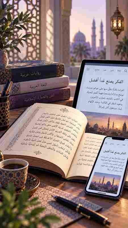
A huge amount of Arabic reading now happens on phones and computers, and scripts that were designed for stone carving or royal decrees don’t always translate well to a small screen. If you want to see that in action, it’s worth trying a few words through an Arabic font generator and watching how naturally Naskh based styles hold their shape at different sizes.

Where You'll Still Find Naskh Today
Naskh never really went out of style, it just moved formats. You’ll come across it in:
- Most printed and digital copies of the Qur’an
- Arabic newspapers, magazines, and novels
- Government documents and official correspondence
- Subtitles and on screen text in Arabic language media
- The default body text in the majority of Arabic digital fonts
Naskh (an Arabic word that roughly means “copying”) started out as a working script. Long before it became the polished, standardized form we recognize today, scribes used early versions of it for everyday writing: letters, contracts, and copies of books that needed to be produced quickly and read easily.
Calligraphers still study and practice Naskh by hand today, often as a starting point before moving on to more decorative scripts. It’s usually the first script taught to students precisely because mastering its proportions builds the foundation for everything else. Anyone curious about how it fits into the bigger picture of Arabic writing can find more background in this look at the broader history of Arabic calligraphy.
Frequently Asked Questions
What does the word Naskh mean?
Naskh comes from the Arabic word for “copying.” It reflects the script’s original purpose as a practical, easy to reproduce style for books and documents.
Who standardized Naskh calligraphy?
The Baghdad calligrapher Ibn Muqla developed the proportional system that shaped Naskh and several other classical scripts in the 10th century. Ibn al Bawwab and Yaqut al Musta’simi later refined that system.
Is Naskh the same as the Arabic font used online?
Not exactly, but it’s close. Most everyday digital Arabic fonts are built on Naskh’s proportions because they read well at small sizes, even when the font itself has its own modern styling.
Why is Naskh considered the most readable Arabic script?
Its letters keep a consistent height and even spacing, and its curves are gentle rather than dramatic. That combination makes it easier for the eye to move through a page quickly, which is exactly why it became the standard for books and print.
Is Naskh used for the Qur'an?
Yes. Naskh is the script used in the large majority of printed and digital Qur’an editions today, largely because of how clearly it reads across long passages of text.
What script came before Naskh?
Kufic came first, dominating Arabic writing from around the 7th to the 11th century. Its angular letterforms suited stone carving, but they were slower to read, which is part of what pushed calligraphers toward more rounded, practical scripts like Naskh.